Delmonico
2020
Graphic Design, Art Direction, Branding

Delmonico / Gastronomic Establishment
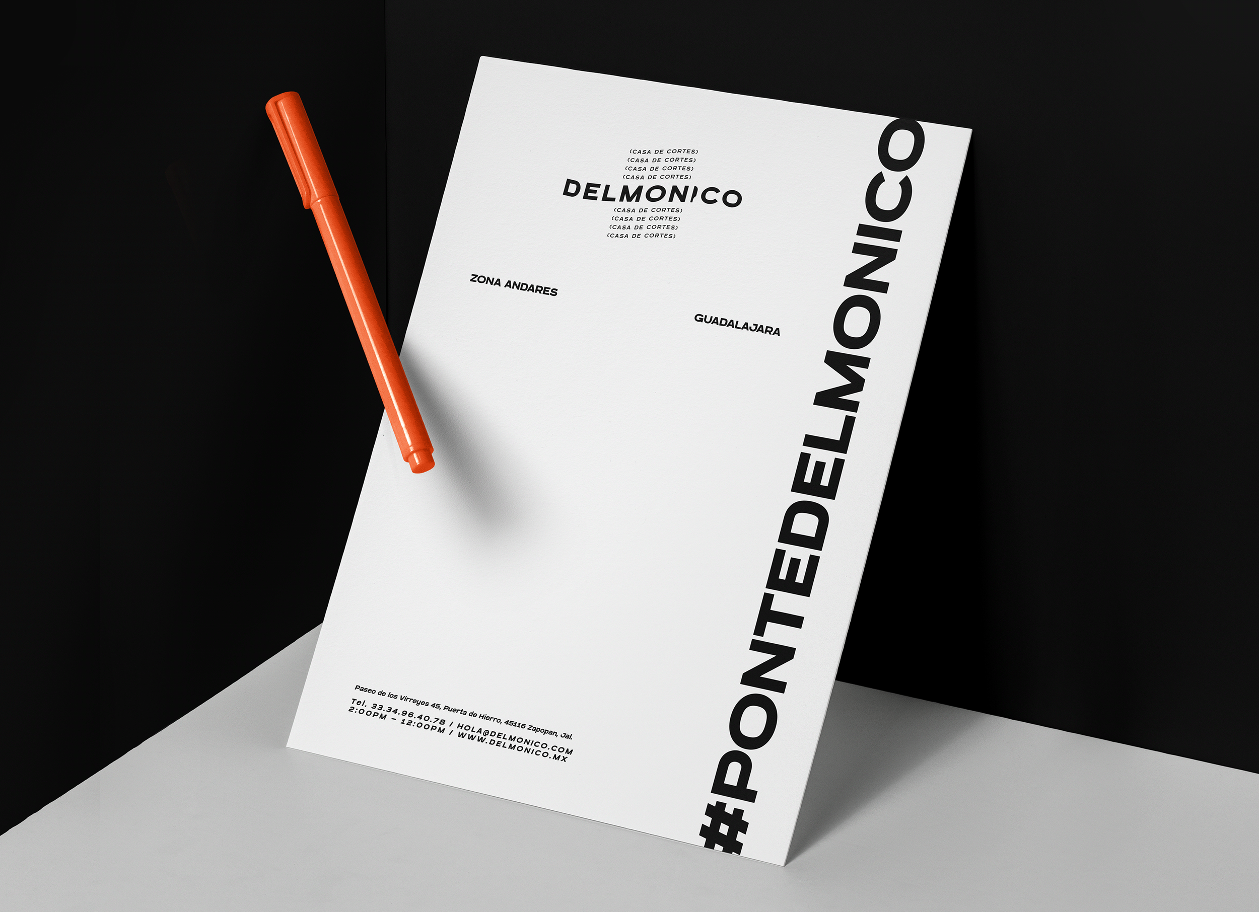
The identity of Delmonico is inspired by the concept of the alternative, movement, and the nonconformity of symmetry. In the space between the boundaries defined by design and disorganization lies an 'order in chaos.' With that in mind, we chose to develop the identity based on this ideology and applied it to a steakhouse. We enjoy challenging traditional norms, got it?
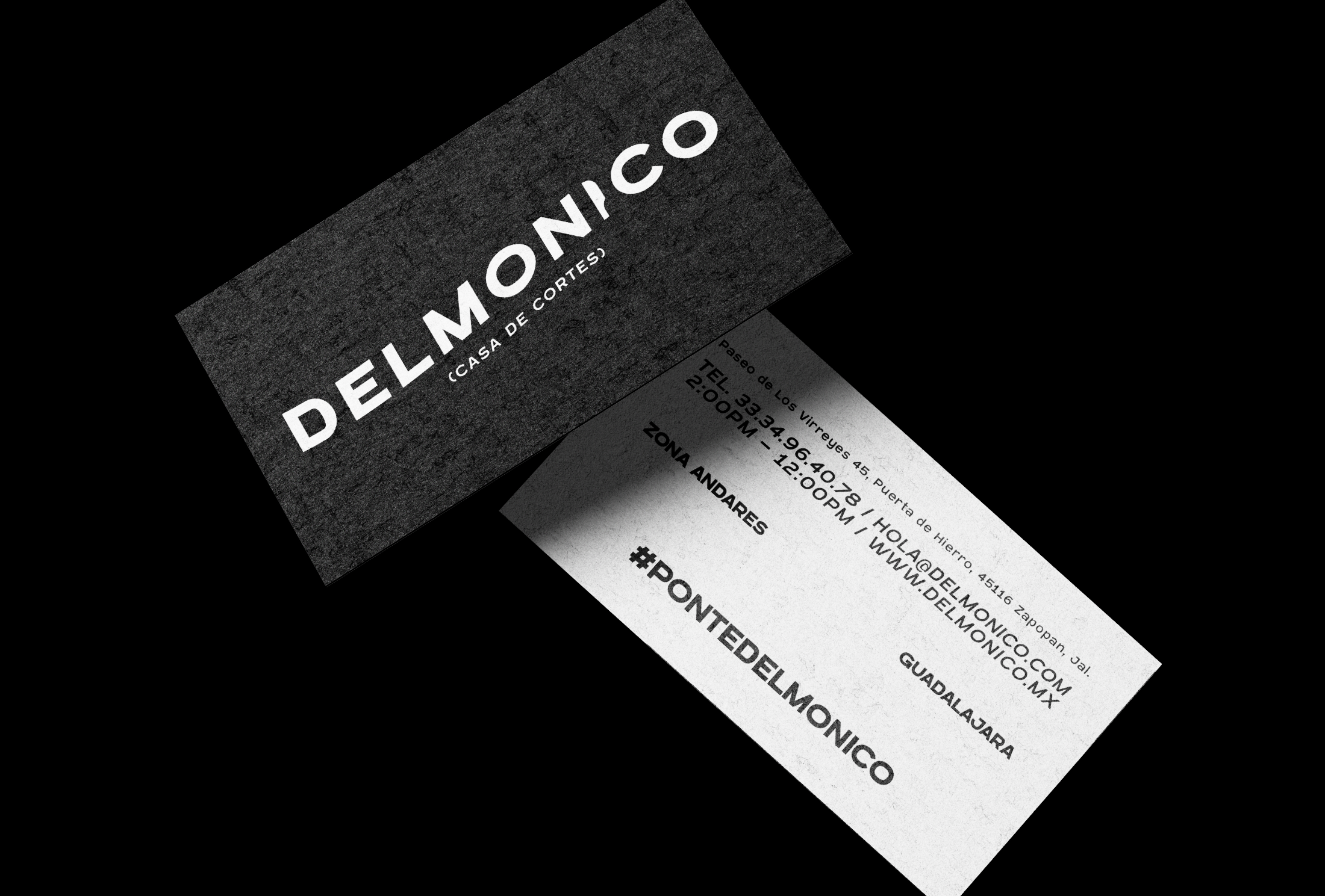
For the construction of the logo, we chose a typography with presence and character. We used the same typography for both the naming and the tagline, but with two of its variants. To ensure the logo was perfectly proportioned, we employed Fibonacci numbers to maintain an ideal balance between the space and size of the logo's elements.


On the other hand, we added movement into the elements of the logo to impart personality. Both elements exhibit a flag curvature with a 30% inclination, coupled with a 6º rotation. Lastly, we sought to integrate the most elemental symbol in the realm of steaks: the knife. We abstracted its form and replaced it with the letter "I".
The icon serves as a visual representation of the character derived from the words 'delmonico' and 'demonic'. It exhibits traits of both a bull (the nose and ears) and a demon (the ears and teeth). Additionally, we imbued it with a 'sarcastic' smile and angry eyebrows.


